Data Visualization
Data visualization is presenting information as graphics, assigning various properties (like length, angle, color) proportionally to the values they represent. Visualizing data can make complex information easier to comprehend and draw attention to patterns which might not be apparent otherwise.
Preparation
Before creating a data visualization, consider:
- What is your intention? What message do you want to convey?
- Who will be the consumers? What will they do differently being informed by the charts?
- How will the value be realized? Will you free up time, help earn more money, or highlight new opportunities?
Picking the Right Visualization
| Use case | Chart types |
|---|---|
| Comparison — differences or similarities between values | Bar chart, Column chart, Combo chart, Multi-set column/bar chart, 100% stacked bar/column chart |
| Ranking — position in an ordered list | Bar chart, Multi-set column chart |
| Change over time — trends | Column chart, Line chart, Area chart, Combo chart |
| Correlation — interrelation between variables | Line chart, Combo chart, Scatter plot, Bubble chart |
| Composition — relation between parts and whole | Stacked and 100% stacked bar/column/area charts, Pie chart, Ring chart |
| Distribution — occurrence or density on a continuous scale | Histogram, Scatter plot, Bubble chart |
| Metric — a quick measure of progress | Big number, Ring chart |
| Flow — volumes of movement between categories or stages | Funnel, Flow chart |
| Spatial — measures over geographical maps | Heat map, Bubble map |
Colors
Colors can be used to:
- Differentiate categories by assigning distinguishable colors.
- Represent quantity on a scale by changing color intensity.
- Highlight elements by increasing contrast.
- Establish relationships by using the same color across multiple elements.
- Convey meaning using meaningful colors (e.g. green for good outcomes, red for bad outcomes).
Do:
- Colors for different data categories should be easily distinguishable.
- Use the same color for the same data category within a widget.
- Try to use the same colors for the same data categories at screen level.
- Choose colors to strengthen brand identity.
Don't:
- Don't rely solely on color — provide other cues like shape, text, and grouping to enhance accessibility.
- Avoid using green, red, and orange together on the same chart (about 8% of males have difficulty distinguishing these colors).
Recommended tokens: Use chart-01 through chart-10 in order.
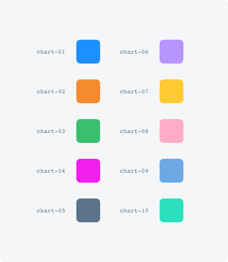
Chart Types
Bar Chart (Horizontal)
Use for: Comparison, Ranking
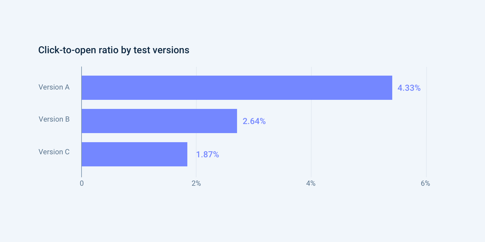
Each category is represented by a rectangle whose length is proportional to the value. Horizontal orientation allows easy display of long category names.
Do: Start the x-axis at zero. Label the axes. Put value labels on bars where possible. Arrange data in descending or ascending order by value.
Don't: Use to display change over time. Apply multiple colors to items of the same kind. Use to compare exactly two values.
Column Chart (Vertical)
Use for: Comparison, Change over time
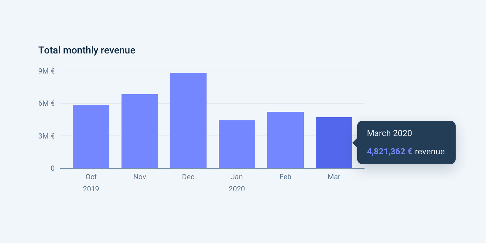
Each category is represented by a rectangle with height proportional to the value.
Do: Start the y-axis at zero. Use for showing change over time, usually one series at a time. Label each category below the baseline.
Don't: Skip time periods, even if there are no values.
Multi-set Bar/Column Chart
Use for: Comparison, Ranking
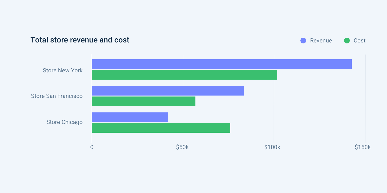
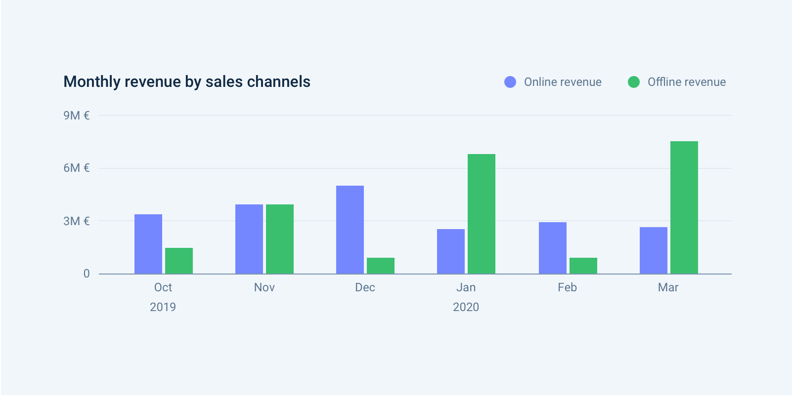
Displays two or more data sets side-by-side, grouped under categories on the same axis.
Do: Apply the same color-coding consistently. Provide color-coded legends. For time series, a line chart with multiple categories works better.
Don't: Use for more than 6 sets.
Stacked Bar/Column Chart
Use for: Comparison, Composition
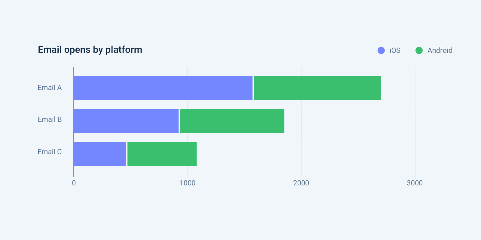
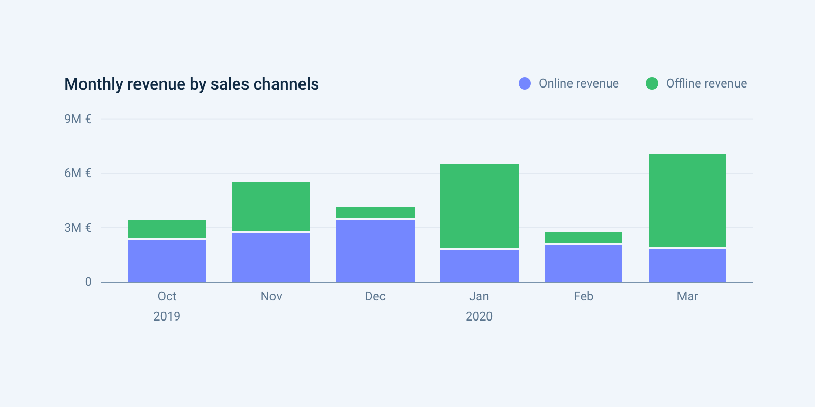
Displays multiple datasets stacked on top of each other to show sub-group composition.
Do: Order bars from largest to smallest. Provide color-coded legends. Provide a tooltip for totals and sub-group values. Use distinct colors matching the variable type.
100% Stacked Bar/Column Chart
Use for: Composition over categories, Composition over time
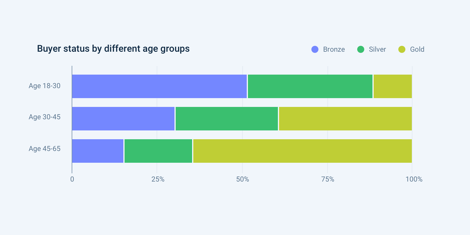
Each primary bar is scaled to the same height, making sub-bars represent percentage contributions.
Do: Provide a non-normalized trend chart nearby so total values are also available.
Don't: Use for more than 3–4 stacks.
Ring Chart
Use for: Composition
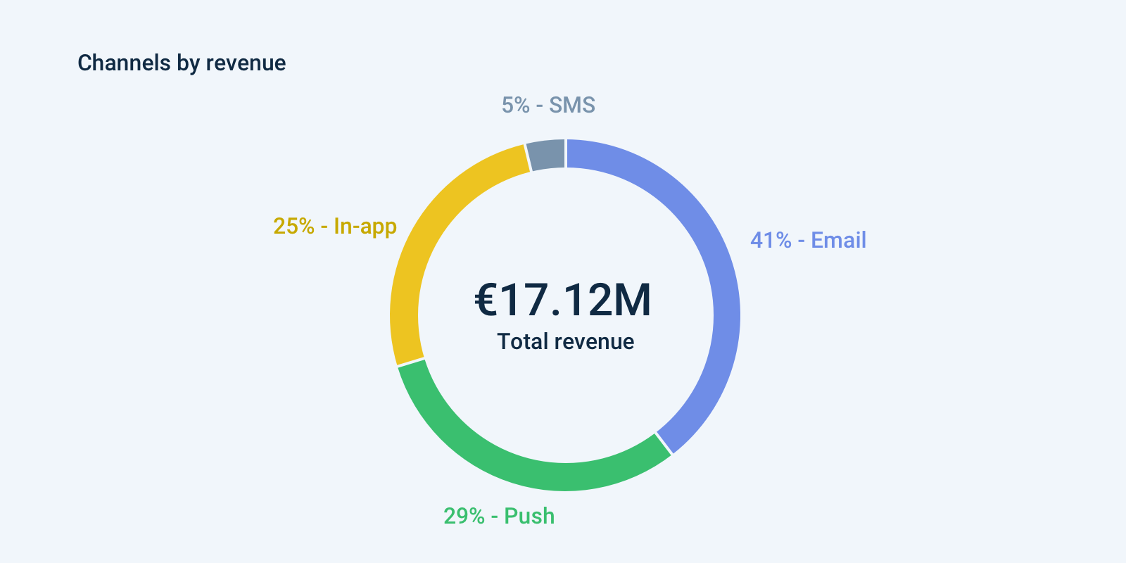
A circle divided into sectors, each representing a proportion of the whole (typically percentages summing to 100%).
Do: Ensure segments add up to 100%. Use just a few categories. Use "other" for many small values. Arrange segments in descending order, clockwise from 12 o'clock.
Don't: Use for more than 3–4 categories. Use for comparing categories (use a bar chart instead). Compare two ring charts side-by-side.
Metric Ring Chart
Use for: Metric
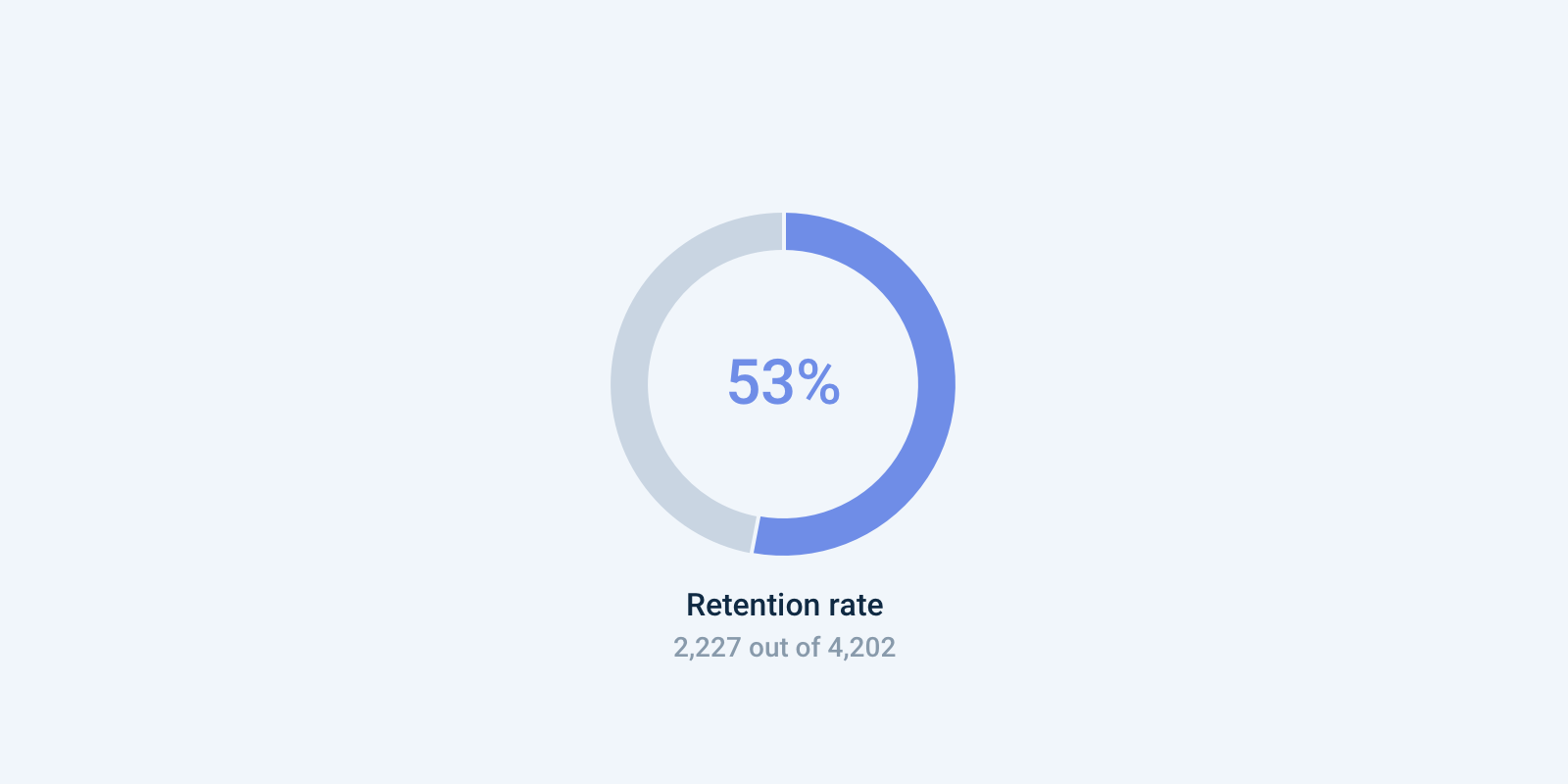
A ring chart showing percentage data for a single metric — best for at-a-glance reports like scores, ratios, or progress.
Do: Provide total numbers alongside the rate. Use for one category only.
Line Chart
Use for: Comparison, Change over time, Relationship
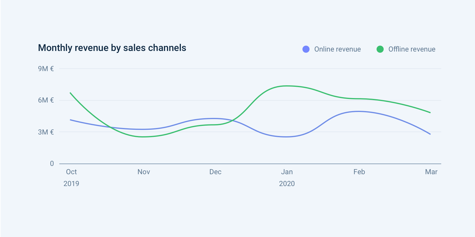
Reveals trends or changes over time within a continuous data set.
Do: Clearly label axes. Provide color-coded legends. Run a color-deficiency test. Provide a date-range selector with daily/weekly/monthly aggregation where possible.
Don't: Compare more than 5–7 categories. Bridge non-consecutive data sets without indicating the gap.
Area Chart
Use for: Comparison, Change over time
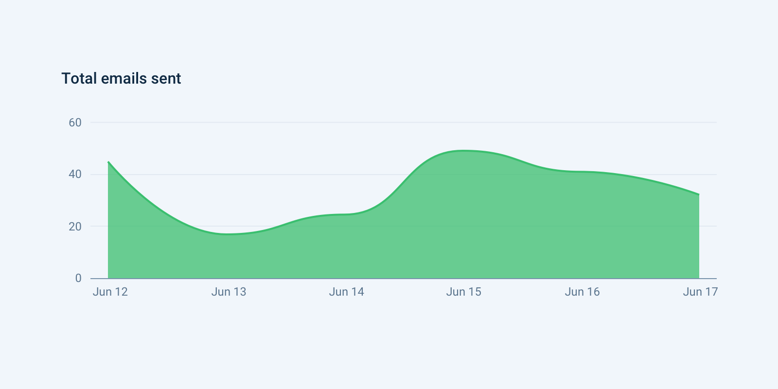
Like a line chart, but with the area under the line filled in to indicate volume.
Do: Use to show the bigger picture (e.g. total population over time rather than net change).
Don't: Compare too many datasets. Layer too many colors. Make viewers do "visual math" — provide labels and legends.
Stacked Area Chart
Use for: Change over time, Composition
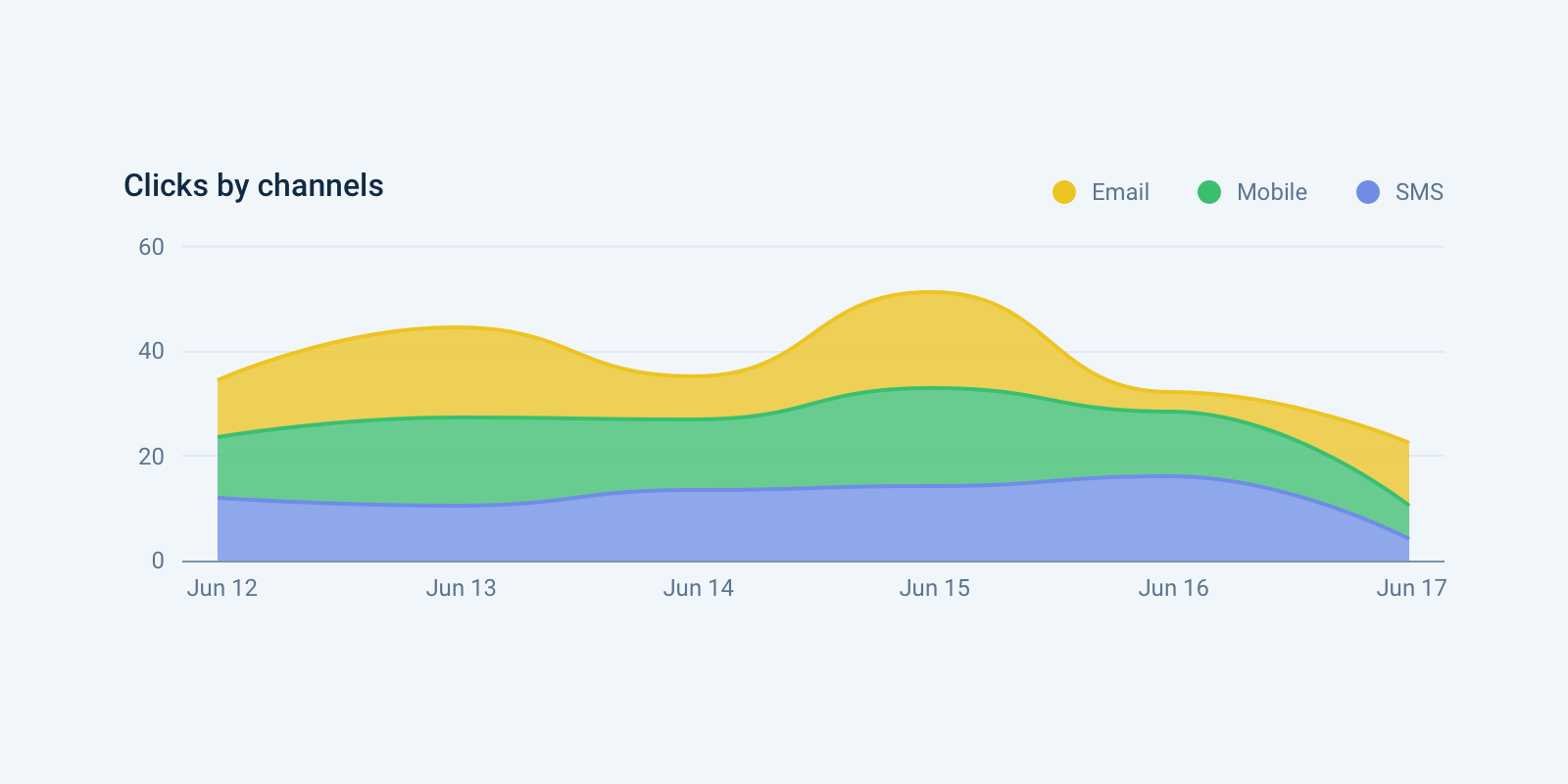
Uses multiple data series, each starting from where the previous left off. Useful for comparing variables changing over an interval.
Do: Use when you have parallel data sets and want to emphasize part-to-whole relationships. Choose a color palette matching the variable type.
Don't: Overlay areas — make each layer visually distinct.
100% Stacked Area Chart
Use for: Composition over time
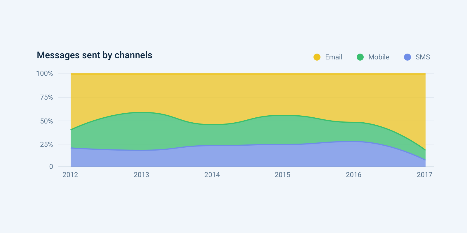
A variation of the stacked area chart where each group's value is normalized at each time stamp, showing percentage of each group in the whole.
Combo Chart (Multiple Axes)
Use for: Comparison, Change over time, Correlation
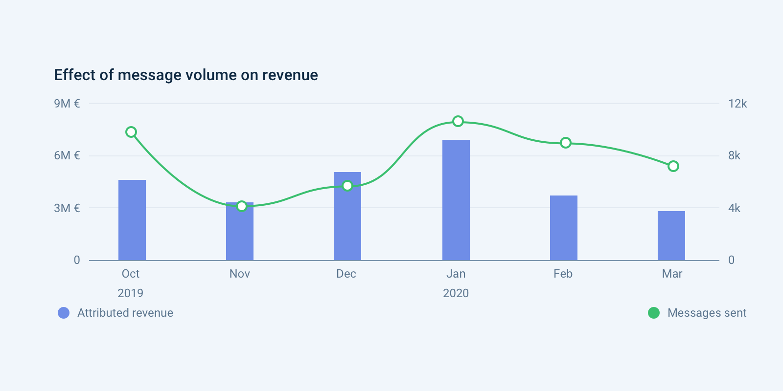
Combines bar and line chart features. Each bar or line represents a particular category.
Do: Make sure y-axes are related. Place the primary y-axis on the left. Use contrasting colors. Provide color-coded legends below each applicable axis.
Don't: Use unless it's the only option — combo charts are hard to read. Compare similar units of measurement. Include more than 4 variables.
Big Number
Use for: Single values, Metric
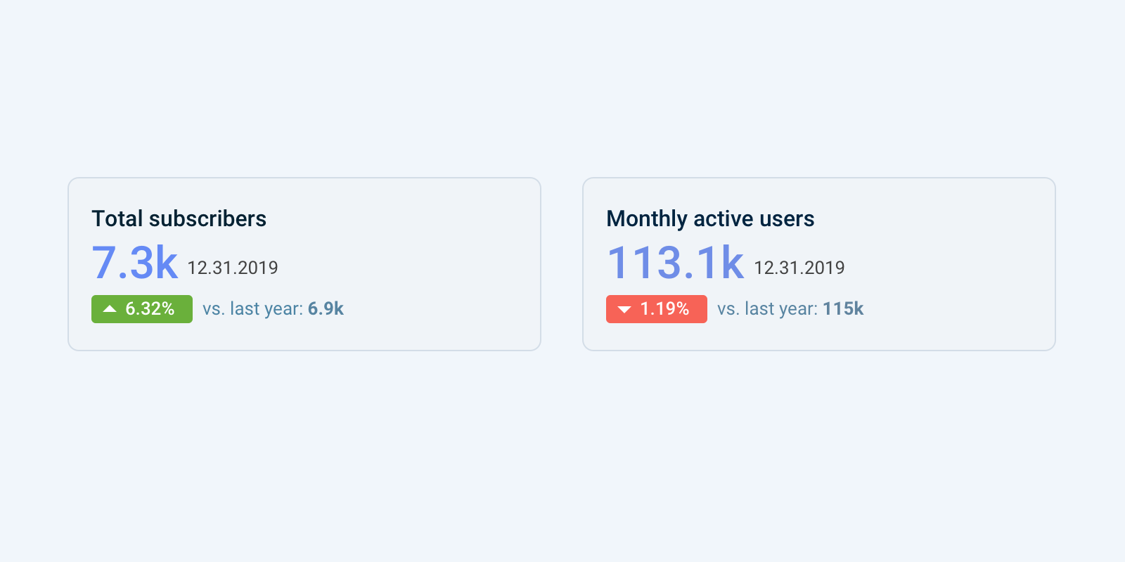
Highlights a single value for at-a-glance reading. Often used when the number needs no context or comparison.
Do: Use green or red indicators to show relative uplift compared to a previous period. Use small contextual text to help interpret the data.