Spacing Guidelines
General Tips
The 8 Pixel Grid
Every unit used in sizes and spacing should be a multiple of 8px (16, 24, 32, etc.).
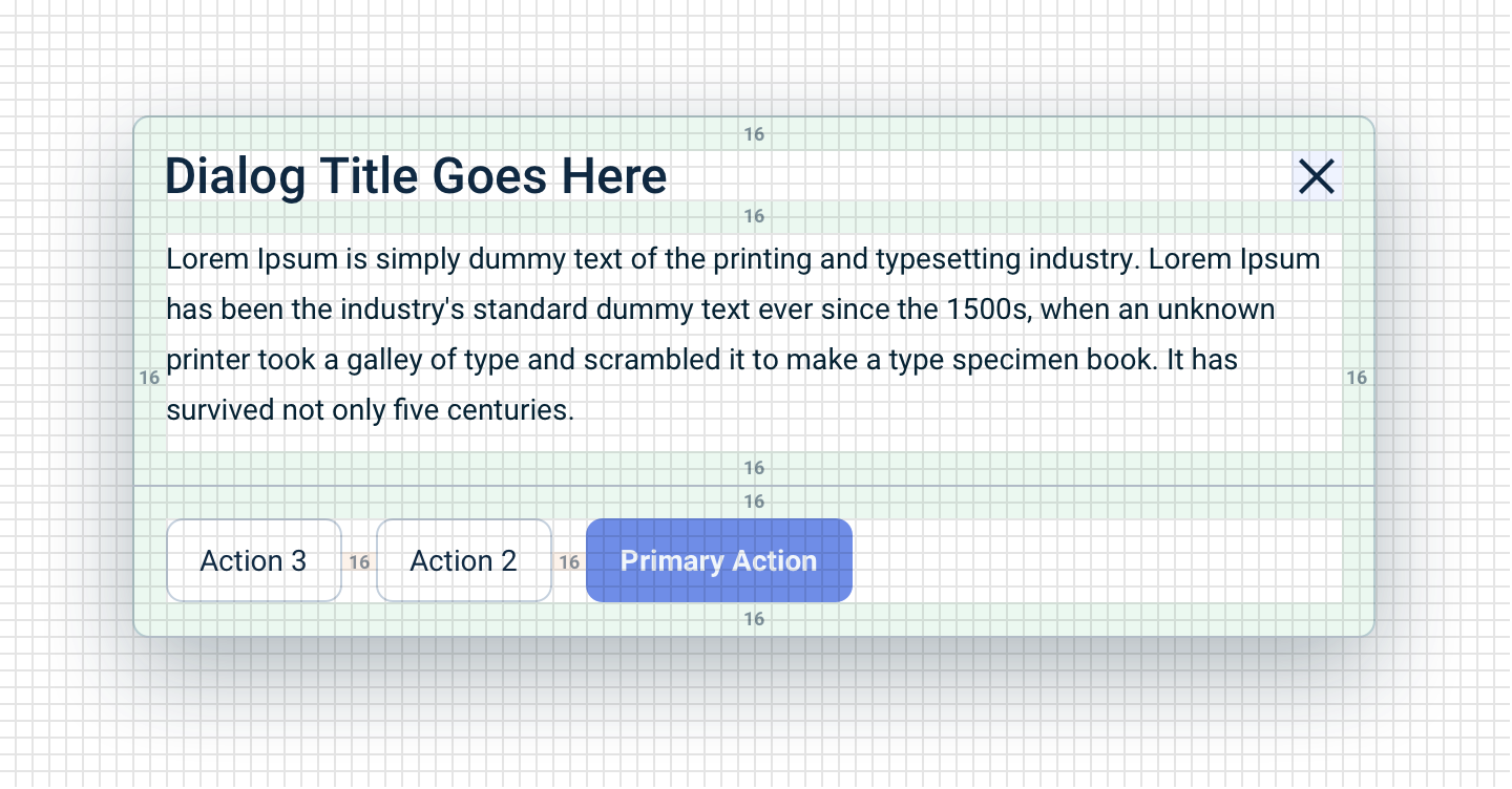
Exceptions:
- For units smaller than 8px, use 4px (half) or 2px (quarter). Avoid units smaller than 8px when possible.
- In rare cases 12px (8 × 1.5) may look best, but prefer 8px or 16px.
Smaller Box, Smaller Padding
Generally, the smaller a container, the smaller its padding should be:
- Large containers (layout containers, floating page dialogs): use L (24px)
- Medium containers (dialogs, popover panels, dropdown lists, buttons): use M (16px)
- Small containers (labels): use XS (8px)
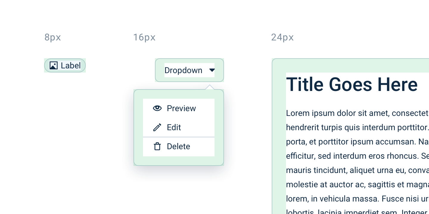
Compound Padding
The padding of a container and the padding of elements inside it can visually merge, making things appear more spacious than intended.
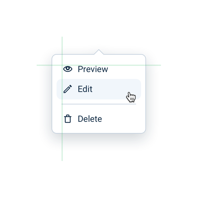
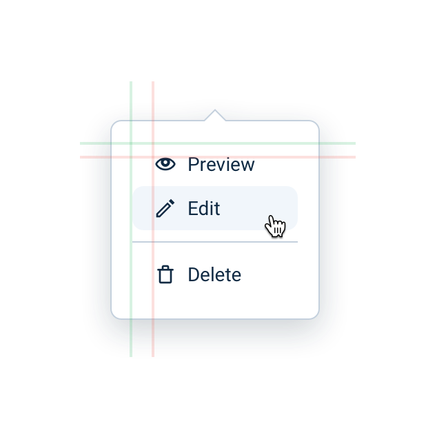
Toolbars and lists: The Dropdown list padding is 16px, but item padding is 8px — visually appearing as 24px, which is too much for a medium container. When a container holds elements with inherent padding (buttons in toolbars, items in action lists), reduce the container's padding accordingly.
 |  |
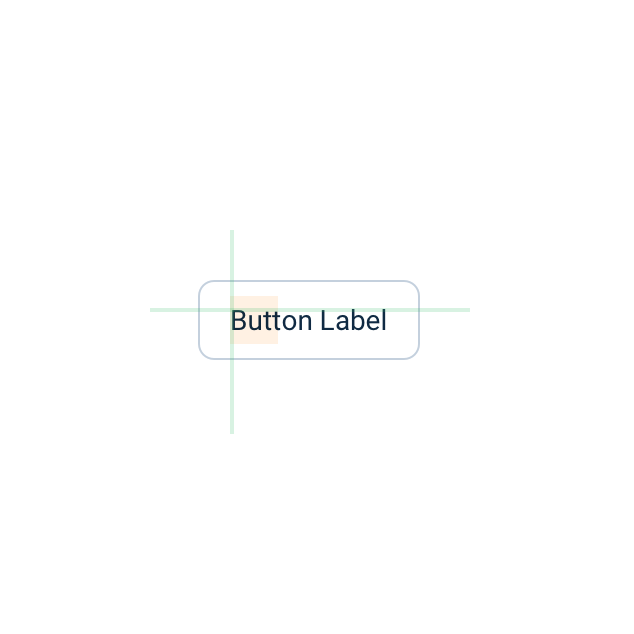
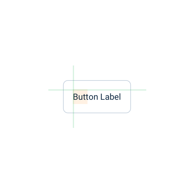
Vertically centering text: Line-height adds extra vertical space to text. To visually center a label in a box, use smaller vertical padding than horizontal padding.
 |  |
Vertical Rhythm
The vertical rhythm of a page layout is mostly defined by element heights, vertical spacing, and text line-height — resulting in a layout that fits visually on a vertical grid, making the interface easier to read and more aesthetically pleasing.
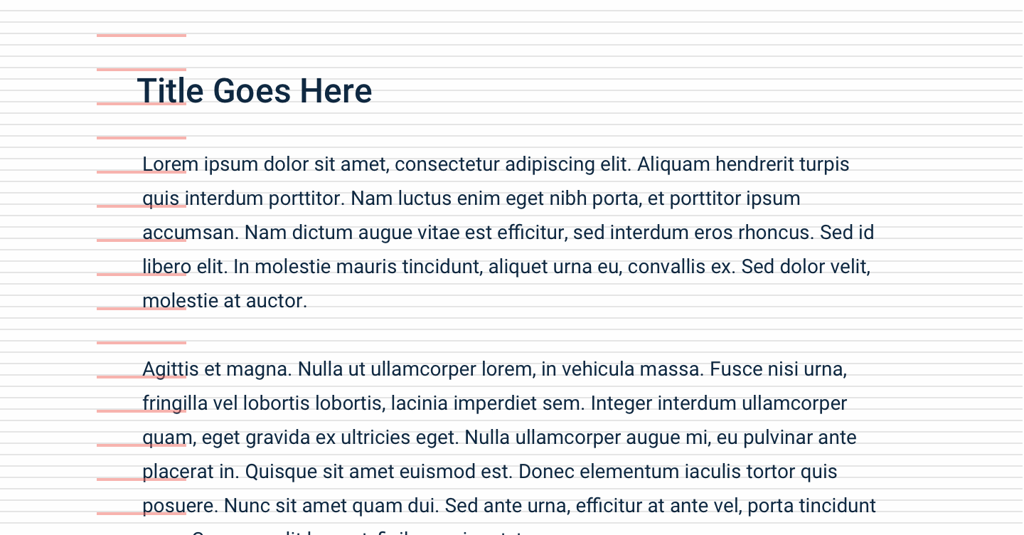
We recommend visually fitting the layout on an 8px vertical grid to give the page a vertical rhythm.
Spacing Scale Reference
| Suffix | Value |
|---|---|
-none | 0px |
-3xs | 2px |
-2xs | 4px |
-xs | 8px |
-s | 12px |
-m | 16px |
-l | 24px |
-xl | 32px |
-2xl | 40px |
-3xl | 48px |
-4xl | 56px |