Rounded Corners
Rounded corners are a stylistic choice to make the SAP Engagement Cloud UI appear more modern, feel more friendly, and add extra perceived fidelity to visual elements — elements with rounded corners "feel" more well-crafted than wireframe-like rectangles with sharp corners.
The measurement of rounded corners is corner radius, defined in pixels or percentage.
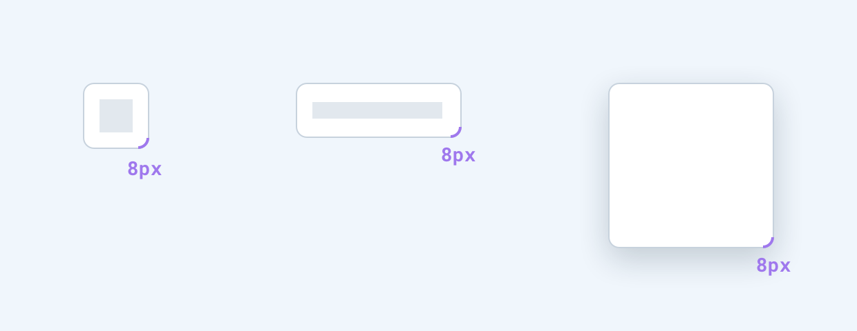
Default Corner Radius — 8px
General corner radius used for most UI elements.
Examples: Buttons, Popover Panels, Tooltips, Widgets, Dialogs.
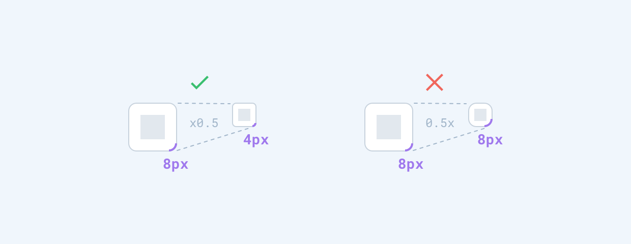
Small Corner Radius — 4px
Should only be used in specific cases, such as when an element with default corner radius is scaled down in size.
Examples: AC nodes in the sidebar, which are smaller views of the regular-sized nodes.
Full Corner Radius — 100%
Used for small elements that are 24px or less in height. Makes elements appear pill-like.
Examples: Labels (Tags).
