States
States visually modify a UI element to convey specific information about its behavior or contents.
- Component states: shows the availability of the element, such as disabled or read-only.
- Focus states: shows whether the element is in focus or not. Focused elements respond to keyboard interactions.
- Interaction states: shows the element's relation to the pointer, such as hover or down.
- Selection states: shows whether the user has selected or toggled the element.
- Value states: shows the intended semantic meaning of the element, such as positive, negative, warning, or information.
Combinations: States can be combined across categories (e.g. an element in negative state can be hovered), but cannot be mixed within categories (e.g. an element cannot have positive and negative state at the same time).
Consistency: The visual modifications for various states can be different for different components (e.g. the hover state of a button and a text input), but some modifications are shared (e.g. disabled state generally looks the same across elements).
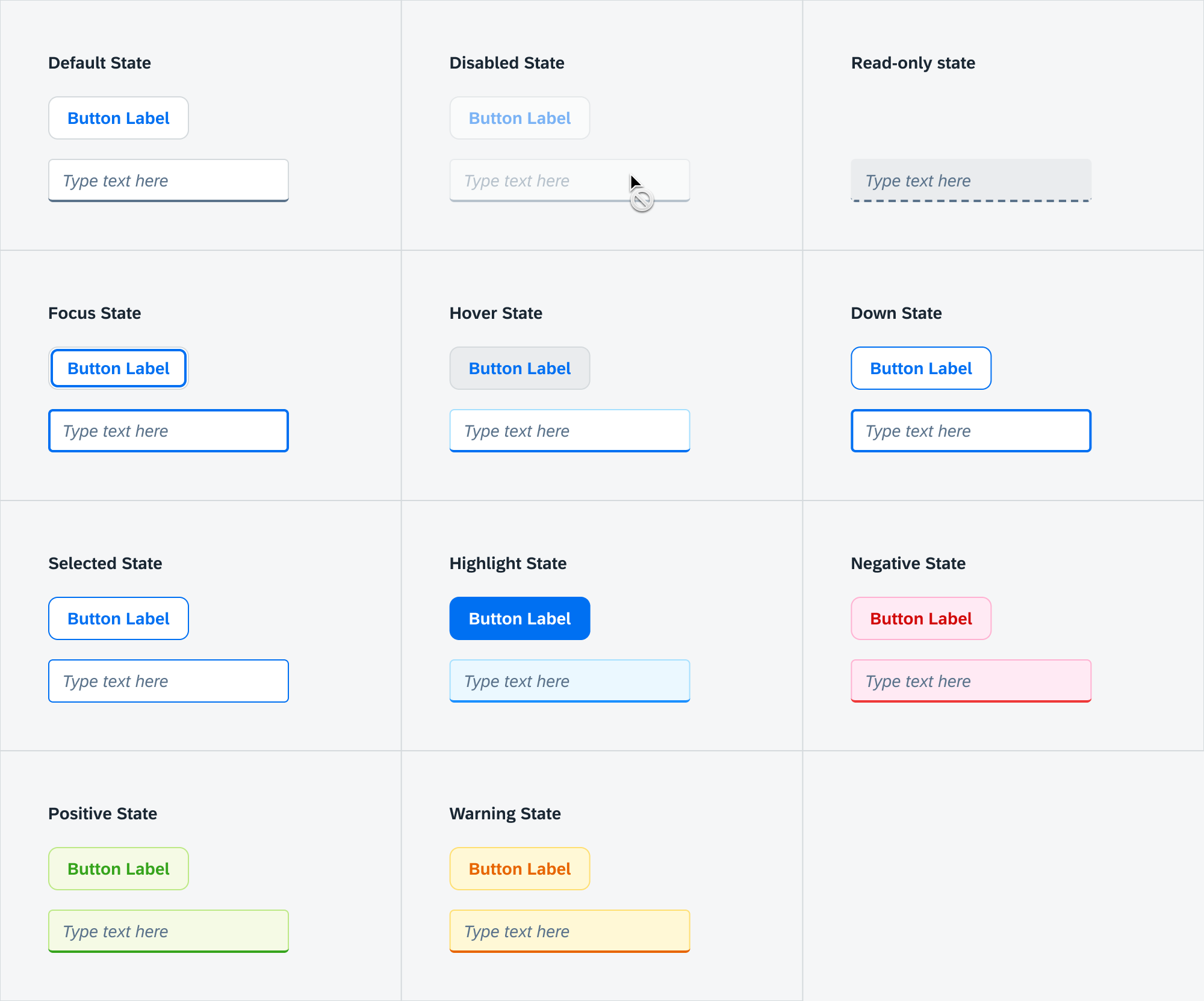
Component States
Shows the element's availability for interaction. Default: Enabled State.
Disabled State
Shows that the user is not allowed to interact with an otherwise interactive element. Disabled elements cannot be focused, and have no hover or down states. Disabled form items are not submitted in forms.
General visual changes:
- Opacity: 40%
- Cursor:
not-allowed
Disabled tooltip: we recommend adding a tooltip that explains to the user why the element is disabled.
Read-only State
Shows that the user cannot change the value of an otherwise editable element. Read-only elements can still be focused, and have hover and down states. Read-only form items are submitted like a regular form item.
General visual changes:
- Dashed underline or border.
Read-only vs static text: If the element can never be edited, make it static text instead.
Focus States
Shows whether the element is marked to receive keyboard input. Default: Unfocused State.
Focused State
Shows that the element will receive keyboard input — for example, hitting the spacebar while a button is focused will activate the button. Typically the element receives focus when the user clicks on it, or uses the Tab key to navigate to it.
General visual changes:
- Focus ring: an inner ring with a thick border.
Contextual focus ring: The focus ring is only shown when relevant, typically during keyboard navigation. Elements like buttons only get the focus ring when focused via the keyboard, not by mouse. Native elements use the :focus-visible pseudo-class for this; custom DS components should follow the same practice.
Interaction States
Shows the element's relation to the cursor or other pointer device. Default: Regular State.
Hover State
Shows that the user has moved the cursor into the element's interactive area. Especially useful on "borderless" elements like toolbar buttons, where the interactive area is not visually apparent.
General visual changes:
- Changes in background color and border color.
- Cursor:
pointer
Down State
Shows that the user is pressing down the mouse button over the element. Also known as "Active" or "Mouse Down" state.
General visual changes:
- Changes in background color and border color.
Selection States
Shows whether the element is marked for selection. Default: Unselected State.
Selected State
Shows that the element is selected, activated, or toggled. The exact meaning depends on the component and context.
General visual changes:
- Highlighted background and border color.
Indeterminate State
Shows that the element corresponds to a list of selectable items where there is a mix of selected and unselected items. Typically used in checkbox lists where the parent item is unselected when no children are selected, selected when all children are selected, and indeterminate when only some children are selected.
Value States
Shows the semantic meaning for the element. Default: Neutral State.
Negative State
Used for elements that carry negative meaning, such as error messages, failed validations, or bad metrics. May prevent users from continuing their work. Also known as "error state".
General visual changes:
- Red tint for background and border.
Destructive buttons: Buttons which lead to destructive actions (e.g. deleting data) use negative state.
Warning State
Warns the user about a minor problem they should take into consideration. Does not prevent users from continuing their work, but they might run into an error later.
General visual changes:
- Yellow tint for background and border.
Positive State
Used for elements that carry positive meaning, such as success messages, passed validations, or good metrics. Also known as "success state".
General visual changes:
- Green tint for background and border.
Information State
Visually emphasizes elements to draw the user's attention. Used for important information the user should read, or highlighted actions such as Submit buttons. Also known as "highlight" or "important".
General visual changes:
- Blue tint for background and border.