Error Handling Guidelines
"Established wisdom holds that good error messages are polite, precise, and constructive. The Web brings a few new guidelines: Make error messages clearly visible, reduce the work required to fix the problem, and educate users along the way."
— Jakob Nielsen
What Is an Error?
Error is an event that stops the system from completing a task, typically resulting in undesired outcomes for the user.
When the system encounters an error, it displays an error message to notify the user. Optimally, the error message also describes the reason for the error, and guides the user to resolve the error.
Error Prevention
Try to prevent the error from occurring in the first place:
- Avoid errors by educating the user and by removing memory burdens, e.g.:
- Use helper text near input field to communicate validation-critical info
- Limit input to force valid formatting
- Use placeholder text inside inputs
- Disable submit buttons until the form is valid
- Explain concepts using tooltips
- Be forgiving when accepting input formats, e.g. dates, phone numbers, etc.
- Ask for confirmation from the user when they are about to perform an action which may lead to an error, e.g. Confirmation dialogs.
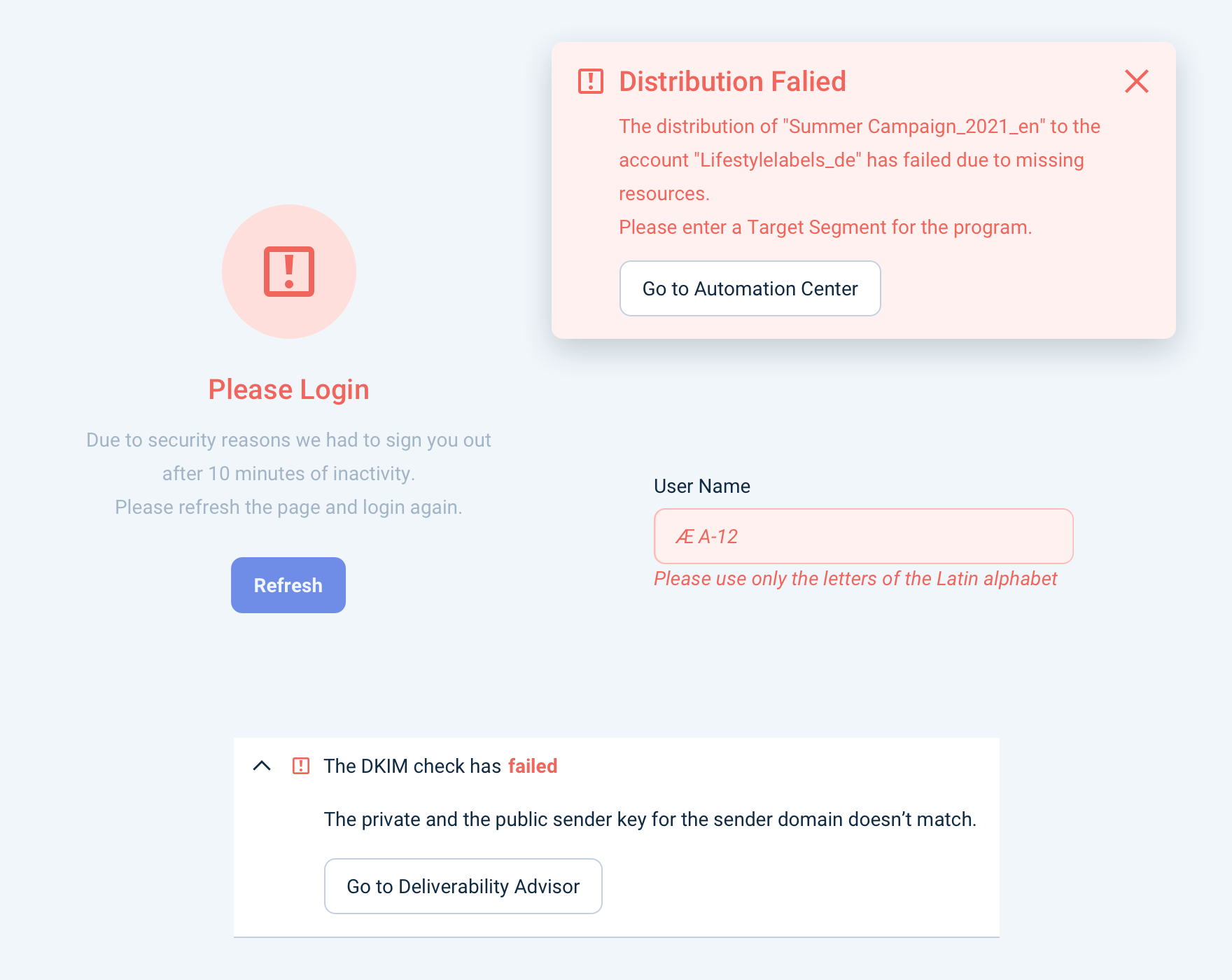
How to Create an Error Message?
If the error state could not be prevented you should always communicate it. Every possible error should be validated and have a specific message. Here are some guidelines on how to do that:
Be in context:
- Validate as soon as possible. E.g. after done filling in an input.
- If possible, indicate the erroneous elements even if they would be out of the fold. E.g. Use floating Notification to indicate some inputs have errors.
Communicate clearly:
- Be precise and respectful when describing the issue.
- Try to keep the message short and simple without getting too technical. E.g. "Campaign name already in use. Please enter another one."
Use error style when available:
- Make sure that the message is recognized by displaying it in an error-styled component variant. E.g. Empty State with error style, Notification with error type, Field with error message, Validator with error status.
Be constructive and actionable:
- Suggest a solution for the problem. E.g. Retry Learn more, Troubleshoot.
- Provide an "escape route" to a safe state. E.g. Undo, Cancel.
Be consistent:
- Align with other error messages in Design System in appearance, behavior, phrasing, and tone.
Error vs Warning
Essentially, use the Warning style to (quite literally) warn the user that something undesired might be happening, and use Error style to display feedback from the system when it encountered an error.
Display warnings:
- The user is in the position to do something that might have undesired consequences, e.g. "You're changing tags for multiple campaigns."
- The system is in a state that might result in undesired outcomes, e.g. "The campaign hasn't been scheduled yet."
Display errors:
- Feedback that the system has encountered an error, e.g. "We couldn't add tags to the campaigns you selected."
"Strong warning":
- For destructive actions (e.g. deleting a campaign), we use a "stronger warning" style, that looks similar to Error. We have specific components for these use cases, e.g. Destructive Confirmation Dialog.