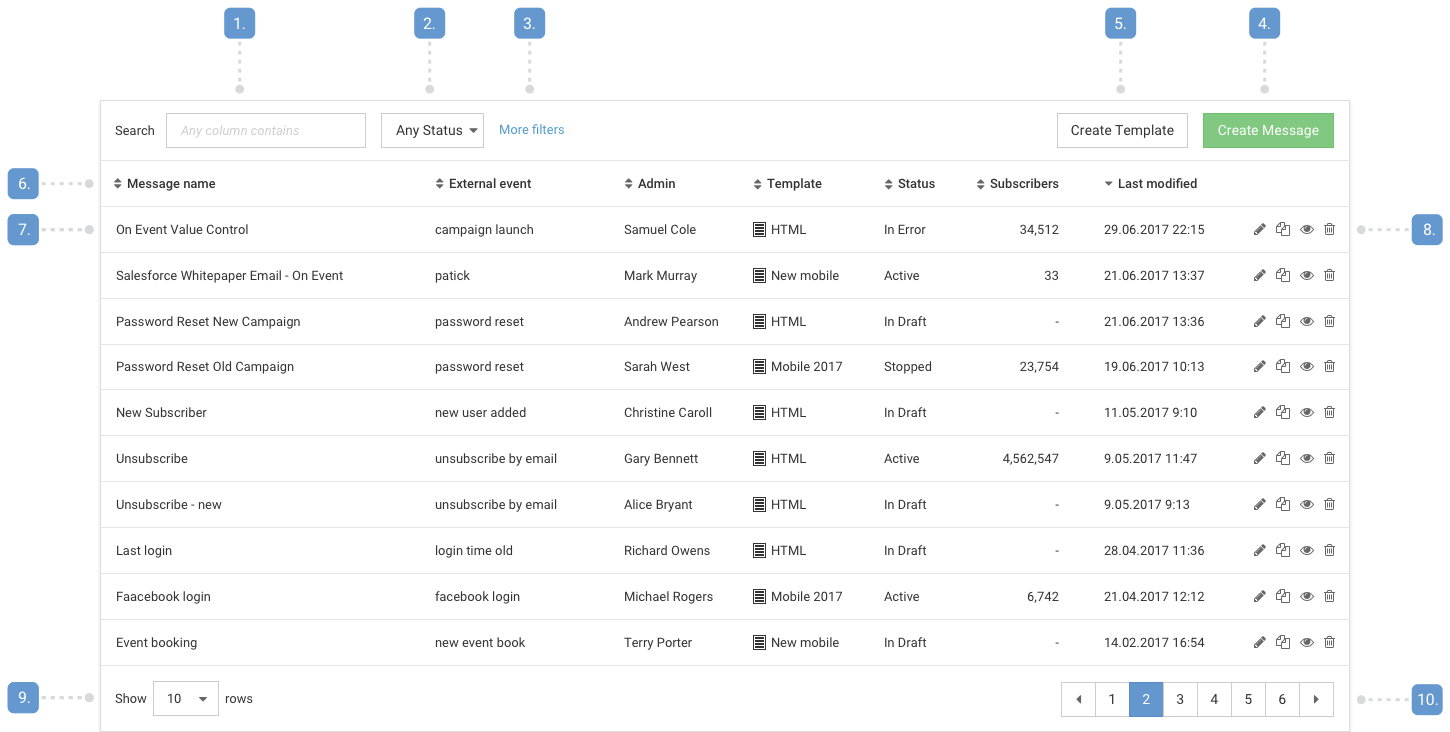
Table Page Guidelines
Use an overview table to show the users a list of items and item attributes for a service. The overview table also acts as the central location to manage items from the same or similar type with actions like create, edit, view, delete.
Structure

- Search box
- Primary filter
- Additional filters
- Primary creation button
- Secondary creation button
- Table header
- Attributes
- Actions
- View option
- Pagination
Best practices
Overview tables should:
- Display an empty state with feature introduction if no items are created yet.
- Have one primary button for creating a new item labelled "Create item" if the user is able to create items.
- Have one or less secondary button for additional action or non-primary way of item creation.
- Have a way to select between available new item variations separately after the primary button has been pushed.
- Help the user quickly find tiems with the search box by making any atribute searchable.
- Have at most one primary filter and all additional filters should be hidden by default (More filters).
- Have 7 or less attributes displayed that help the user identify items and get basic insights in the items:
- 2-3 attributes to identify the exact item (for example name, admin, etc.)
- 1 attribute to show workflow status,
- 1 attribute to show the last modification date (for default ordering),
- 2-3 additional attributes or settings.
- Be sorted by default to last modification.
- Provide sorting to every attribute.
- Have column width that avoids line breaks in the attributes.
- Use right align for number attributes, where it's important the user can compare the values.
- Use the same number of decimals if percentages are displayed.
- Use left align for any other information.
- Provide tooltips for longer information, descriptions and calculations that help the user understand the item attributes.
- Show "-" (dash mark) if a piece of information is not available.
- Have 4 or less actions displayed.
- Display more actions in an overflow menu ("…" icon).
- Never display an overflow menu with only one item.
- Provide a way to view deleted items, if Delete action is avaliable to the users (soft delete, may be under More filters).
- Show 10 items by default.
- Remember the setting if the user changes it.
- Have a pager disaplyed even if it displays only one page.
Try to avoid:
- Showing more than 7 attributes, this makes the screen look cluttered, and keeps the user understanding what is important and what is not.
- Showing more than 4 actions, this makes important actions stand out less.
- Having too narrow field widths (values would be wrapped) or too wide field widths (users may think additional information is missing).
- Showing repeating symbols in everry row, use the attribute header to show these.