Spacing Guidelines
General Tips
The 8 Pixel Grid
To make thinking about spacing easier, we use a 8 pixel grid — which means, every unit used in sizes and spacing should be a multiplication of 8 (16, 24, 32, etc.).
Exceptions:
- For smaller units than 8, use 4px (half) or 2px (quarter). But if possible, avoid using units smaller than 8.
- In rare cases, using 12px (8 x 1.5) might look the best. But if possible, avoid using 12px, and use either 8px or 16px instead.
Smaller Box, Smaller Padding
Generally, the smaller a container is, the smaller padding it should have.
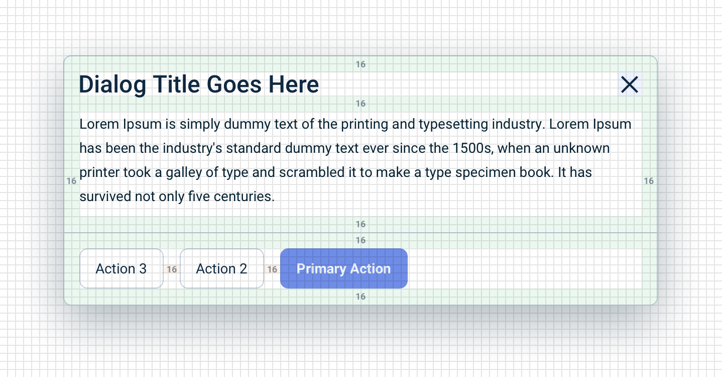
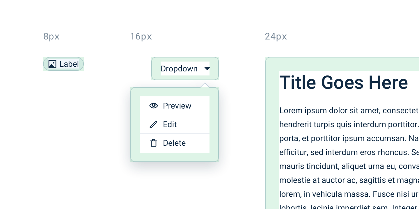
- For large containers (layout containers, floating page dialog), use “L” size (24px).
- For medium-sized containers (dialogs, popover panels, dropdown lists, buttons), use the “M” size (16px).
- For small containers (labels), use the “XS” size (8px).
Compound Padding
The padding of the container and the padding of the element inside might visually merge together, making things appear more spacious than intended.
Some examples:
Toolbars and lists: The padding of the Dropdown list is 16px, but the padding of the items in the Dropdown list is 8px, making the padding visually appear 24px — this is too much for a medium-sized container!
In this case, when we expect the container to contain elements that has that effect (e.g. orderless Buttons in toolbars, menu items in the Action List), the padding of the container should be reduced.
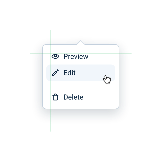
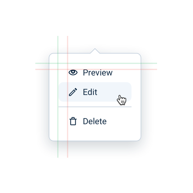
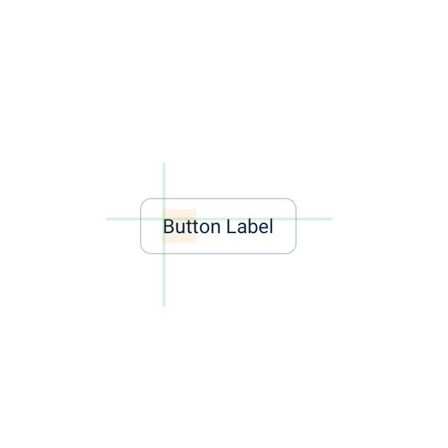
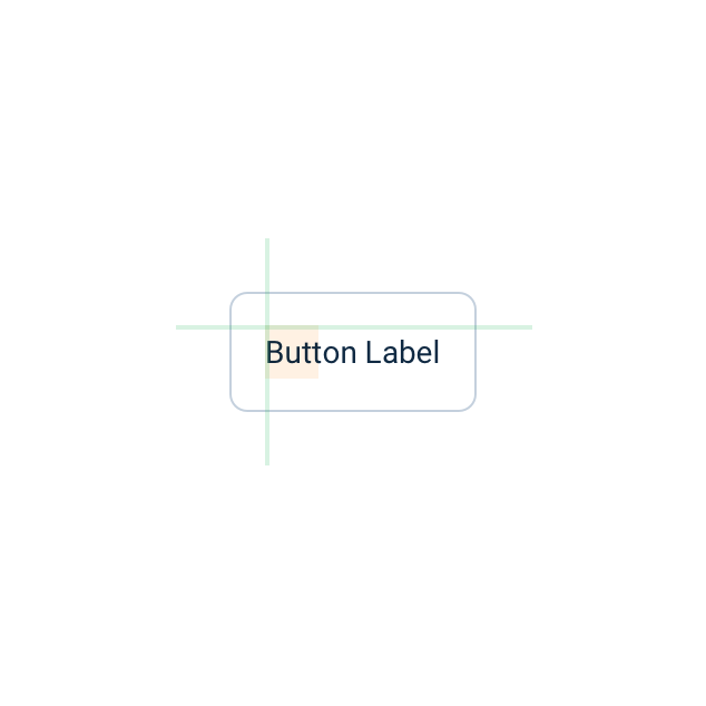
Vertically centering text: Line-height tends to add extra vertical space to text, which means if you want to visually center the label in a box, you have to use smaller vertical padding around the label than horizontal padding.
How Much Spacing Should I Use?
Our UI Framework include spacing rules both for components and for simple inline HTML elements used for text formatting (e.g. the paragraph element, <p>). These default spacing rules should work properly, but there might be use-cases where you need implement custom spacing.
For choosing the right custom spacing, here are some tips:
- Use the points mentioned in this guide: use the 8px grid, use smaller padding for smaller containers, and mind compound padding.
- Inspect similar components and layouts in Emarsys for reference.
- Some of the Gestalt Laws are related to spacing. In general, put less space between elements that belong in the same group, and more space between elements belonging in different groups.
Grid Systems
We have a flexible grid system with fluid column-width and variable gutter sizes.
On a technical side, we have two solutions for grids: a legacy Bootstrap-like CSS grid, and the modern flex-based grid. We recommend using the flex-based grid.
We don't have grid requirements for layouts, so use them when you need them!
Setting sizes for components: Instead of size attributes, we recommend using our grid system to display elements in the desired size.
You can learn more about our grids on the Grids & Spacing page.
Vertical Rhythm
In general, the vertical rhythm of a page layout is mostly defined by element heights, vertical spacing between elements, and text line-height — resulting in a layout that fits visually on a vertical grid, making the interface easier to read and more aesthetically pleasing.
In our Design System, our typographic elements and components come with default sizing and spacing that can enable proper vertical rhythm on a page, but the end result can depend on the implementation. There are many components where the height is determined by its contents.
We recommend visually fitting the layout on a 8px vertical grid to give the page a vertical rhythm.
Overriding Default Spacing
Our components have built-in margins and paddings, but we also have CSS utilities to safely override those default values.
Check out our CSS Utility Classes for more details.
| Class Suffix | Value |
|---|---|
-none |
0px |
-3xs |
2px |
-2xs |
4px |
-xs |
8px |
-s |
12px |
-m |
16px |
-l |
24px |
-xl |
32px |
-2xl |
40px |
-3xl |
48px |
-4xl |
56px |