Rounded Corners
Rounded corners are mostly a stylistic choice to make the Emarsys UI appear more modern, feel more friendly, and add extra perceived fidelity to the visual elements (i.e. elements with rounded corners "feel" more "well-crafted" than wireframe-like rectangles with sharp corners).
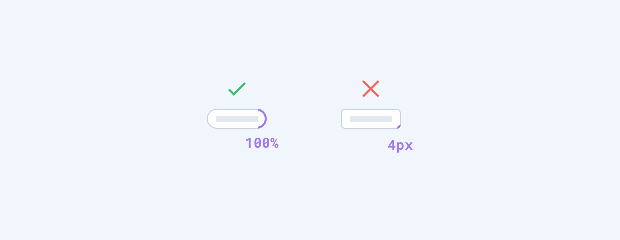
The measurement of rounded corners is corner radius, and can be defined in pixels or percentage.
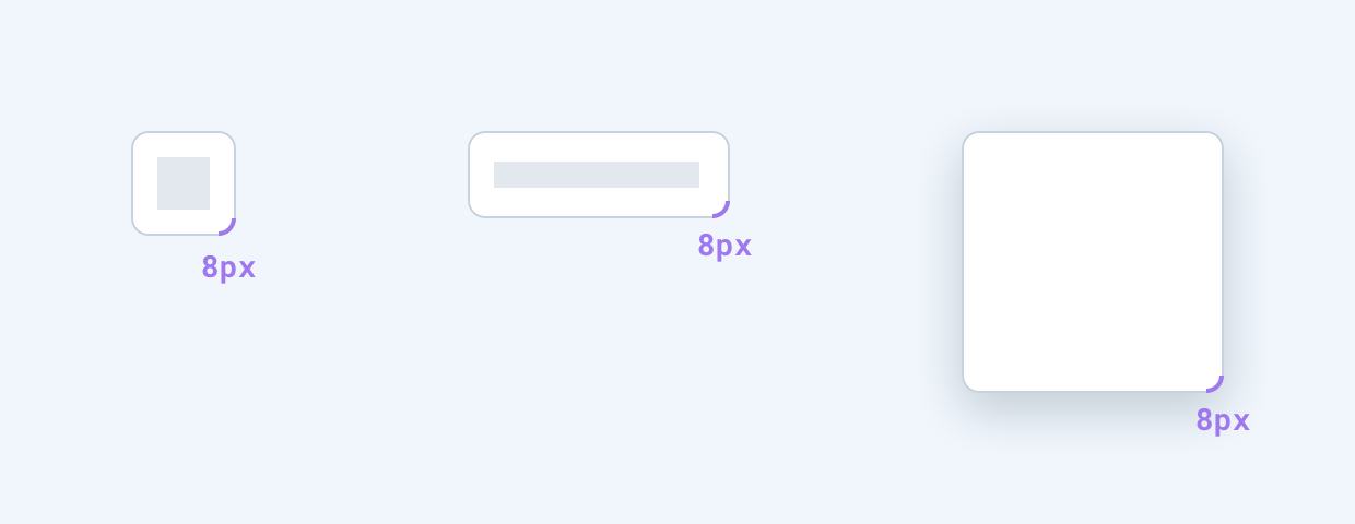
Default Corner Radius (8px)
General corner radius used for most UI elements, e.g. Buttons, Popover Panels, Tooltips, Widgets, Dialogs, etc.
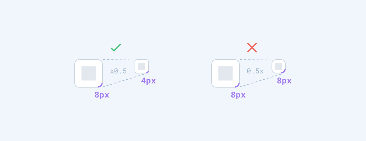
Small Corner Radius (4px)
Small corner radius should only be used in specific cases, like when an element with default corner radius is "scaled down" in size, e.g. AC nodes in sidebar, which are just smaller views of the regular sized nodes.
Full Corner Radius (100%)
Used for small elements that are 24px or less in height, e.g. Labels (Tags). Makes the elements appear "pill-like".