AI Button
Intro
AI buttons allow users to trigger AI-powered actions.
Usage
Do:
- To enable users to access AI-powered functions.
- To group AI actions related to one specific element or page.
Don't:
- Where AI-powered functions add no value.
- For non-AI functions.
Best Practices
- Adhere to the rules for SAP design system buttons. For details, see the button guidelines for SAPUI5 and SAP Web Components.
- Use secondary action buttons by default.
- Use primary buttons only for the primary action on the page or panel.
- Only use leading icons.
- Only use the “AI” icon.
- Use concise button labels that clearly describe the action they represent.
- Don’t include “AI” in the button label (such as Create with AI, Enhance with AI, Generate with AI).
Variants
- Button: Use the simple variant for scenarios involving a single AI action. Your button label and tooltip must clearly reveal that the action is enabled by AI.
- Dropdown: Use the dropdown variant to offer multiple AI actions. Users can select and trigger an AI-powered action from the drop-down menu.
- Icon-only button: Use the icon only AI button if there is limited space, or if that is the entry point for the AI feature. In this case the AI button indicates the AI enhanced version of the existing feature, e.g: the Subject Line input can be filled manually, but it can be generated with AI as well. Use the tooltip to indicate the feature or action.
- Icon-only dropdown: AI button with icon and dropdown.
Behavior and Interaction
The example below shows how the AI button changes during the content generation process.
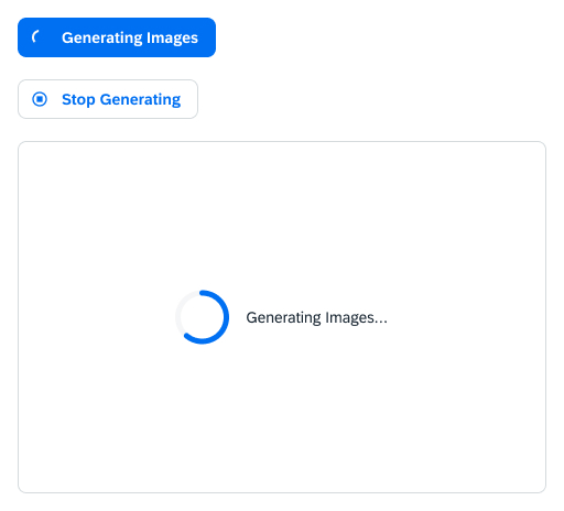
- Clicking the Generate AI button triggers content generation.
- During content generation, the button changes its appearance and function, depending on the technical options.
- The Generate button changes into a disabled Generating button with a loading spinner or busy indicator. Use this pattern if stopping the generation process is not possible for the external models.
- The Generate button can change into Stop Generating with the “abort” icon.
- Once generation is complete the button changes into an AI button or into an AI dropdown button if necessary.
<button class="e-btn">
  <e-icon icon="ai"></e-icon>
  Generate
</button>

<e-tooltip content="Subject Line Generator">
  <button class="e-btn e-btn-onlyicon">
    <e-icon icon="ai"></e-icon>
  </button>
</e-tooltip><e-dropdown data-markup-content="<e-icon icon="ai"></e-icon> Generate" data-markup-class="e-btn e-btn-dropdown">
<div class="e-dropdown__content">
<a class="e-dropdown__item" href="#0">
Create Variants
</a>
<a class="e-dropdown__item" href="#0">
Rewrite
</a>
<a class="e-dropdown__item e-dropdown__item-disabled" href="#0">
Action 3
</a>
<a class="e-dropdown__item" href="#0">
Action 4
</a>
</div>
</e-dropdown>
<e-tooltip content="Generate">
<e-dropdown data-markup-content="<e-icon icon="ai"></e-icon>" data-markup-class="e-btn e-btn-dropdown">
<div class="e-dropdown__content">
<a class="e-dropdown__item" href="#0">
Create Variants
</a>
<a class="e-dropdown__item" href="#0">
Rewrite
</a>
<a class="e-dropdown__item e-dropdown__item-disabled" href="#0">
Action 3
</a>
<a class="e-dropdown__item" href="#0">
Action 4
</a>
</div>
</e-dropdown>
</e-tooltip>